By Dana Hinders
Have you ever started a new coloring project and found yourself unable to choose the perfect colors to start your picture? If so, you might want to try a complementary color scheme.
Basic Complementary Color Schemes
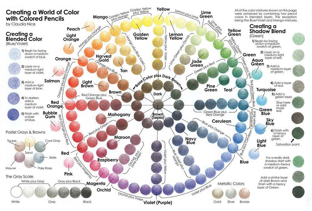
Complementary colors are two colors that are directly opposite each other on the color wheel. (If you don't already have a color wheel, it's well worth picking one up at your local art supply store or on Amazon. This is an inexpensive reference for all sorts of creative endeavors.)
There are three basic complementary color schemes:
Complementary colors get their name because one is warm and the other is cool. When placed next to each other, they each make the other appear more intense. In color theory, this principle is known as simultaneous contrast.
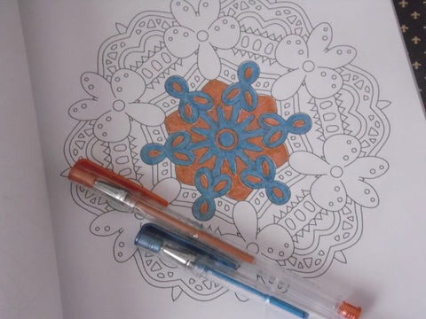
Mandalas are great for experimenting with color schemes because there are no rules. You aren’t bound by the idea that grass needs to be green or that the sun should be yellow, which leaves you with unlimited options.
In the example below, blue is the cool color and orange is the warm color. However, using metallic gel pens gives the design a bit of shimmer.
Using Complementary Color Schemes with Tints, Tones, and Shades
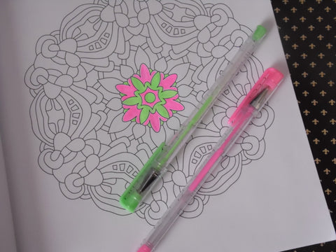
Complementary color schemes can also include tints, tones, and shades.
Tints, tones, and shades give you an endless array number of variations on a simple complementary color scheme. For example, red and green make most people think of Christmas. However, add a bit of white to these colors and you get a pink and mint green color scheme that makes you think of springtime. Add black and you have a maroon and hunter green color scheme with a preppy and fashionable feel. Add gray and you get a dusty rose or marsala and mossy green or olive, giving your adult coloring book page a subtle and sophisticated look.
If you have a large collection of coloring supplies, it might be helpful to sort everything by color so you can see at a glance what tints, tones, and shades you have available. Some people like to go every further and create a reference book of color swatches. If you do this, leave a section in the back of your book so you can record your favorite color combinations as you work.
Making Your Colors Pop with Neutrals
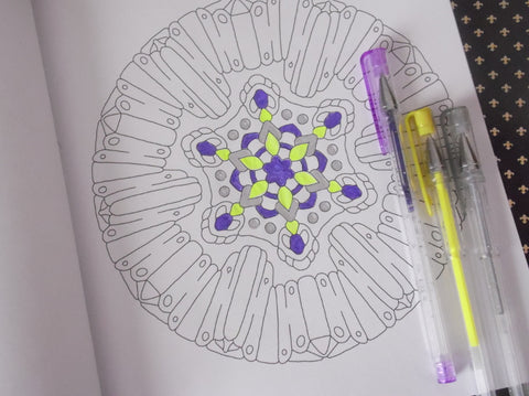
When you mix together any two complementary colors, you get a neutral.
Although you can't really mix gel pens, markers, or colored pencils, you can apply this principle to your adult coloring book pages by adding a few neutral accents to your design. Using Art-n-Fly's glitter or metallic gel pens works especially well for this purpose.
In the example below, a bright yellow, purple glitter, and silver metallic gel pen add flair to a simple mandala design with a complementary color scheme.
-----
All example photos were created using pages from Stress Less Coloring: Mandalas by Jim Gogarty.

Is there anywhere to buy that color wheel?

I came here to read about the color wheel and read the entire list of articles. I’ve colored for 5years but did everything on my own. I had no feedback or other people’s work to look at. Thank you so much for being here and giving tips to help me improve. My technique has improved tremendously in just 3 pictures.
xoxo
August 16, 2023
xoxo