Whether you're picking out paint for the walls, framing artwork, or swapping out bedding, your favorite colors are a huge part of designing your home. Odds are it's an amalgamation of color combinations and more just than neutral hues (unless you're a true minimalist). Choosing exactly the right shades for your desired color palettes can be tough, though, even when you know what you like. That's where the color wheel chart can help.
The color wheel has been around for nearly 400 years, but it's rare for those of us who aren't design professionals or artists to reference it. You probably go to your paint deck or Pinterest board instead. Those are both great ways to get color pairing ideas, but the color wheel chart is nearly an exact science. In fact, it was invented by Sir Isaac Newton in 1666. That's right, the same man who brought us the laws of physics developed the color wheel.
Everyone perceives color slightly differently—those who are color-blind may see gray instead of red—but color is actually much more about light reflection than individual perception. The color wheel chart gives you a precise way to find combinations that work together effortlessly. Read on to learn color wheel terminology and see examples of designer palettes you can draw from the color wheel.
Reading a Color Wheel
Color Wheel Terminology
- Neutral: black, white, brown, and gray
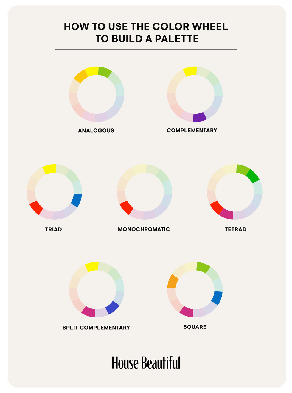
- Complementary: opposites on the color wheel, which appear brighter when they are used together (examples: yellow and purple, red and green, blue and orange)
- Split complementary: the grouping of a color with the two hues analogous to its complementary color (yellow with red-violet and blue-violet, for example)
- Secondary: a combination of equal parts of two primary colors (secondary colors are green, orange, and purple)
- Triad: any three colors equally spaced on the color wheel, one of which usually takes precedence in a color scheme (yellow-orange, blue-green, and red-violet, for example)
- Primary: pure colors (red, yellow, and blue) that combine to create all the other colors on the wheel
- Tertiary: a combination of equal parts of a primary and a secondary color
- Analogous: neighbors on the color wheel
- Chroma: a color's brightness or dullness
- Shade: any color with black added; also refers to slight variations in a color
- Tint: any color with white added
- Tone: a color's intensity or its degree of lightness or darkness
Using a Color Wheel to Build a Color Palette
Monochromatic Color Palette
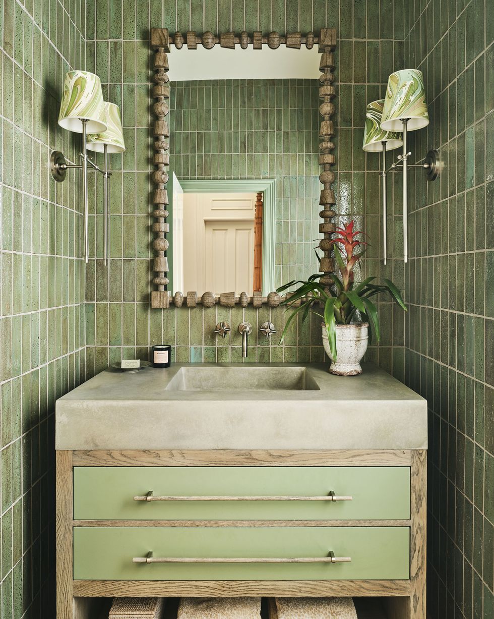
When in doubt, opt for a one-and-done color palette. Using tones, tints, and shades of a singular color can make any room look instantly put together. Designer Shazalynn Cavin Winfrey opted for a green-on-green palette to make this bathroom feel clean and cozy at the same time.
Complementary Color Palette
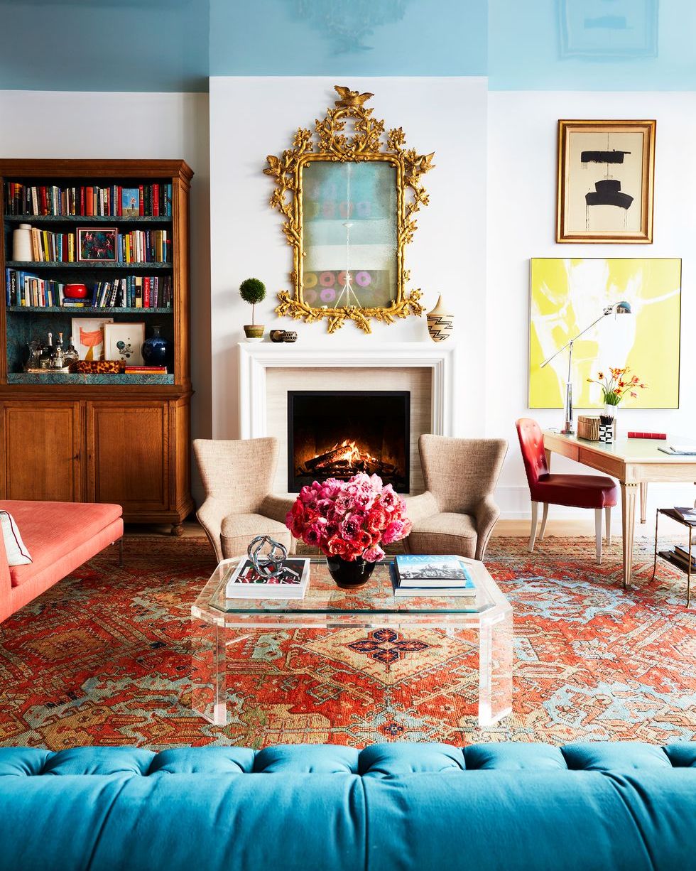
Situated directly across from each other on the color wheel chart, complementary colors are proof that opposites attract. Use the built-in pairings to create contrast without clashing. In this living room by designer Nick Olsen, an orange area rug is a strong foundation for the turquoise ceiling and other blue accents.
Triadic Color Palette
Color pairings like blue-green, red-violet, and yellow-orange are all considered triadic thanks to their primary plus secondary makeup. In this bunk room, a cool-toned palette takes center stage and creates a playful yet masculine setting that's ready for sleepovers.
Analogous Color Palette
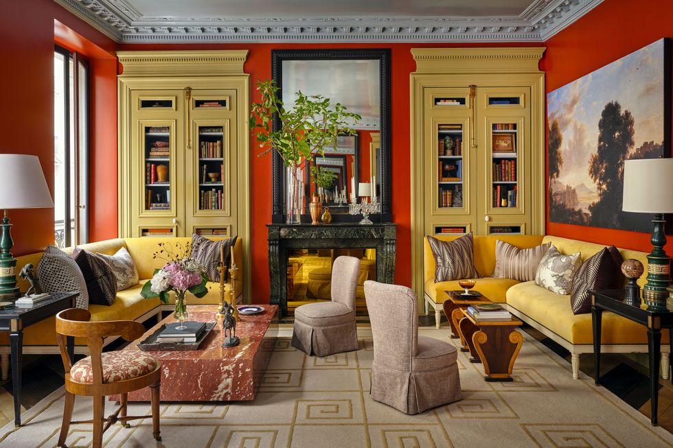
Analogous palettes consist of colors that sit next to each other on the color wheel chart, like red and yellow. As evidenced in this striking living room, designer Garrow Kedigian used this kind of palette to his advantage in his own Paris apartment, creating a bold yet harmonious space that's maximalist without feeling overdone.
