Jonathan Ive: Principles and Philosophy of Powerful Design

Design always played a crucial role in product development. Many companies attach great importance to this aspect, especially Apple is a great example of a company whose design has helped to rise to new heights. Anyone can recognize these minimalist, well-designed devices. It is difficult to find a person who would not admire the appearance of devices such as iPhone or iMac. But who actually was behind their appearance?
This is Jonathan Ive - a person who had a crucial influence on the appearance of the above-mentioned devices, but also others, such as iPad or Apple Watch. He also helped design the Apple Store and Apple Park.
By analyzing Jonathan Ive's works, we will try to conclude what features good design has.
To fully understand Jonathan Ive's approach to design, we must go back to the roots. A major influence on Ive's approach to design had Dieter Rams, who is primarily known for his design for Braun and developed Ten Principles for Good Design. Let's see what principles he distinguished: Good design:
is innovative
makes a product useful
is aesthetic
makes a product understandable
is unobtrusive
is honest
is long-lasting
is thorough down to the last detail
is environmentally friendly
is as little as possible
Here are some examples of how Rams has had a huge impact on Ive's approach to design.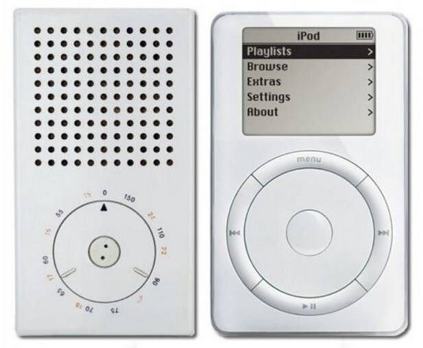
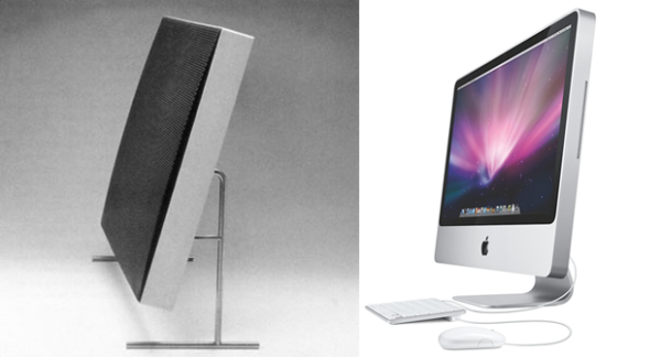
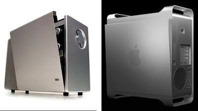
Many critics have argued that Jonathan Ive was copying Rams. Dieter Rams, in turn, claimed that Apple uses the same basic principles that befitting good design.
It is often said that history comes full circle, in the case of design, this principle also works, because Rams's saying "Less, but better" is somehow a reference to the principle of the famous modernist architect Ludwig Mies van der Rohe - "Less is more". They both point to the important role of simplicity and this leads me to the first principle that I want to highlight.
Minimalism and simplicity. The less, the better.

iPhone (2007)
At first glance, you can see how much Apple appreciated the minimalist look. Apple’s product has never been flamboyant or flashy, but clean and straightforward, which makes them impactful in every way. This minimalist look works perfectly on a psychological level as well. It is worth adding that properly designed minimalist products give the impression of fullness on the one hand, and on the other hand leave room for the magic of intuition.
The customer, noticing properly balanced simplicity and modesty in products, sees a free space for interpretation. This is a powerful stimulus because minimalist products encourage dialogue, the customer's intuition begins to engage, making him more associated with a given product or service. This person's trying to understand the product in his own way. Because it's all about intuition and connection.
Note that when you are dealing with a product or graphic that is too abundant, you’re not engaged. Because there’s no space for you. Your intuition has no way to interact, thus you cut yourself off the product emotionally. When there’s no open space, the customer doesn’t engage. He becomes disconnected.
So you want to find that "sweet spot", where the design is interesting enough to engage the customer, but also leaves space for his intuition to interact. Otherwise, there will be no engagement or connection.
"There is beauty when something works and it works intuitively" - Jonathan Ive
The minimalist design is powerful design.
Remember the 10th rule - good design is a little as possible.
2. Useful

iOS 7 (2013)
iOS 7 has taken a new direction by completely redesigning the user interface. The refreshed appearance of the operating system was designed with the need to adapt Apple to more technologically advanced times. One of the biggest overhauls replaced an outdated interface with a modern, flat aesthetic. The new-look was described by Jonathan Ive as "profound and enduring beauty in simplicity".
Slimmer typography, flattered icons, elegant color palette, and new subtle animations were the factors that definitely ended the era of skeuomorphism (interface objects that mimic their real-world counterparts), which was looking kind of cheapy. Jonathan Ive wanted to remove all the unnecessary elements and bring the order to the complexity.
The new version of the operating system also brought new features in terms of functionality. for example quick access to frequently used tools and programs by swiping up from the bottom edge of the screen. It also introduced a new ad hoc service called AirDrop, which allows transferring files among Macintosh computers and iOS devices by wireless communication. Double-tapping the home button displayed a list of open applications, allowing you to manage them faster. Also, the Notification Center has gotten a makeover. Notifications were ordered differently and organized into three categories ("All", "Missed", "Today), which allowed them to be better managed.
The new approach to usability was very evident in terms of shortcuts that allowed quick access to many functionalities. iOS 7 somehow started putting the user on the path of multitasking.Coming back to the design side, it is worth paying attention to the new elements that combined gave a user a sense of connection with the device. Firstly, new, subtle animations and wallpapers with the “Parallax” effect gave the impression of movement, which made the user more engaged. Secondly, the use of layers and transparency gave the sense of depth, despite of “flat” direction. Thirdly, more bright and vibrant colors created a modern and subtle atmosphere that harmonized very well with the aforementioned functionalities.
To sum up, the main factors that made ios 7 incredibly useful are:
Features that were focused on quick accessibility and multitasking
Visual layer that was warmed and combined with subtle animations etc. gave the user a sense of connection.
3. Understandable

Macbook Air (2008)
Good design is primarily about clearly defined functionality and structure. The features make the user's intuition without any instructions, senses how to make use of the product. Making the product understandable is possible by creating a coherent system that defines the order and hierarchy. Then the complexity of the product becomes understandable through intuition. Order, hierarchy, and cohesion are the subconscious user guide that makes a product clear in use.
Understandable design must be user-centric, which means prioritizing and hierarchizing it facilitates the use.
Look at the design of the MacBook, it's as minimalistic as possible. In addition, it is characterized by order - at the bottom of the screen there are the most-used app icons and at the top, there is only a menu bar that allows quick access to files. You may find such a solution extremely simple and undemanding, but it only seems so on the surface level. The art of prioritizing and simplifying is complicated and tricky because it requires us to be able to put complexity in a box. It is quite a challenge to simplify the complex technology so that users can use it intuitively. It’s effortful, but it’s also required to make a product understandable. You have to let the user go your way, direct them without direct guidance.
4. Unobtrusive

Legacy of Jonathan Ive
This is a collection of devices designed by John Ive. By looking at this picture, you can easily capture the rules I’ve mentioned as well as readily grasp them. The fourth principle that I want to highlight is that Jonathan Ive's design is inconspicuous, it is somewhat neutral and integrated with the environment. it also applies to the above products.
Note that all the principles I have listed are closely related to the user's intuition. Unobtrusive design works on a similar pattern. Firstly, it is subconsciously inviting and secondly, it leaves room for self-expression.
Users don’t like being told to do something noticeably. It is about exerting influence in a neutral way.
5. Thorough in the greatest detail

Apple Watch (2015)
I like to flip through design catalogs and magazines very often. I try to capture the idea that shaped the product. When I was analyzing Apple Watch, the principal came to my mind that a good product has been designed with complete accuracy in every inch. Of course, this watch is also minimalist, useful, and understandable - has its own operating system and is also perfectly integrated with other Apple devices. But the accuracy with which this watch was designed touched my heart especially.
What appeals to me the most is the shape of the bezel and the location of the two main buttons. It seems to me that the magic is in how the main element of the watch was shaped, it gives the impression of being very modern. In my opinion, the whole thing is well complemented by the watch strap, I especially like the texture.
Designing an application for Apple Watch must be a real treat for UX designers. This device sets the bar high when it comes to user experience.
The product feels like a standalone device that can be used independently, without any other Apple products. Apple watch can serves as a practical tool to help you manage your daily tasks. It reminds me of the approach to multitasking functionalities based on quick accessibility, which John has applied brilliantly to iOS 7.
The device that can be considered as a breakthrough, captivated me the most with the thorough in the greatest detail.
The Apple Watch is a device that incorporates the philosophy and principles of good design that distinguished Jonathan Ive. Of course, all the 10 Principles of Good Design by Dieter Rams also apply to the Apple Watch.
If you are interested in participating in a valuable community focused on building all kinds of products and growth-philosophies (books, polymaths), consider following me on Twitter
I’m focused on building this kind of community where people can share their ideas :)
Summary:
The five rules of good design, which can be seen in the example of Jonathan Ive are:
minimalistic
useful
understandable
unobtrusive
thorough
All the above-mentioned principles are naturally related to each other, you cannot separate them. Good design is characterized by the mutual support of these principles. Apple Watch is a good example of incorporation these rules. The most important feature of these rules is they create a strong link between user and product unobtrusively.
If you find it valuable, I encourage you to follow me on Twitter :) - click